UI Thoughts
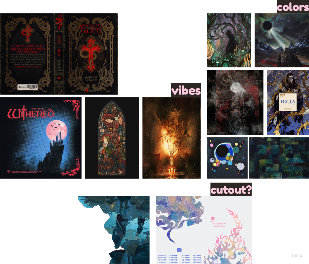
- Something painted for the main menu? A cut out of some sort? Selected images from Miro board to use as main references:

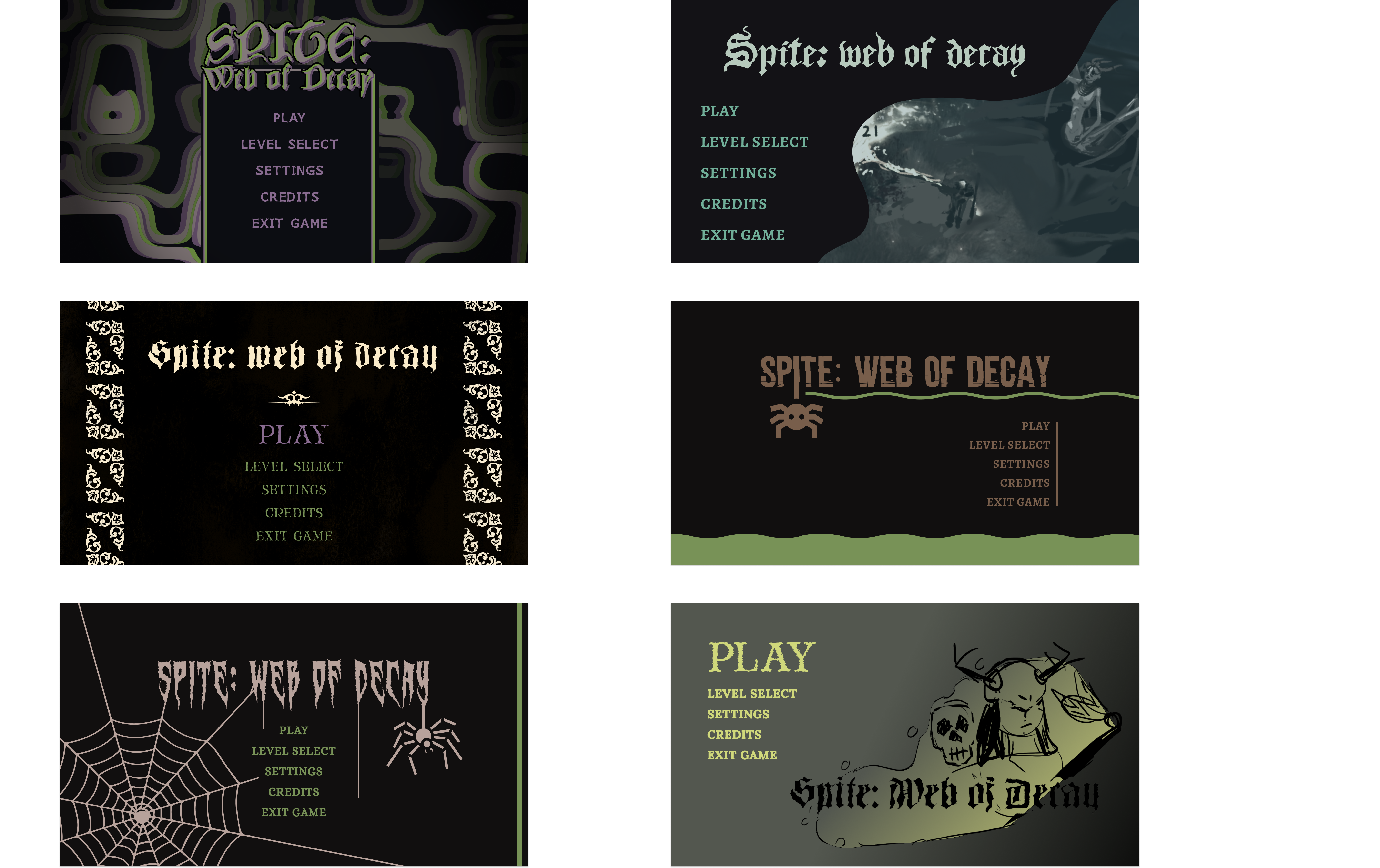
UI Mockup Menus - First Draft
 I just realized I accidentally wrote 4 twice, that was not on purpose. Whoops, too late to do anything about it now though :shrug:
UI Feedback - First Draft
- Which mockups people like most:
| Mockup | How many? |
|---|---|
| 1 | 2 |
| 2 | 2 |
| 3 | 3 |
| 5 | 1 |
| 6 | 3 |
Dexter Feedback
Background/Feel
- Background in 6 is cool, and also represents the game more.
- 1 is cool but doesn’t represent the game as much.
- 3 feels too retro, 4 too simple and 5 too try hard on the spider theme.
Title font
- 1 is cool, 5 is cool but cliche, 3/5 are too hard to read, 2 is fine but generic, and 4 is too brutalist.
Buttons
- 2s are the best, they’re simple and easy to read, their left-alignment also gives more focus to the image to the right.
- 2s buttons are also easy to read because of their size, the buttons should be kept at this size so they’re easy to read. Especially if they’re not centered on the screen.
- 3s buttons are also nice since they’re centered which gives more focus to them. The font on them is also easy to read and clear but could be a bit wider.
- 6s buttons are too close to each other, 1s are too retro-like, 5s are too squeezed together (there’s also a ton happening around them), 4s buttons are a bit small and the right-alignment is a bit odd since there’s nothing to show off to the left (such as art).
Misc. Feedback
- 3 is more Diablo like, 1 fits the game well. Combine gothic theme from 3 with psychedelic vibe from 1?
Feedback Takeaways
Mockup 1 = 2 people
- Cool doesn’t represent the game that much.
- Cool, represents the game but not very gothic or Diablo like.
Mockup 2 = 2 people
- Generic title font
- Easy to read buttons, ideal button size. Left-alignment gives more focus to image.
Mockup 3 = 3 people
- Background/vibe is too retro.
- Title font is hard too read.
- Buttons are nice since they’re centered which gives them more focus. The button font is easy to read but could be a bit wider.
- Diablo like.
Mockup 4 (not an actual contender)
- Too simple
- Left-alignment off buttons feel weird since there’s nothing (like art) to show off to the right.
Mockup 5 = 1 person
- Too try hard on the spider theme.
- Buttons too squeezed together, there’s also a lot of noise around them.
Mockup 6 = 3 people
- Background is cool since it’s directly linked to the game and shows off our player character.
- Buttons are too close together.
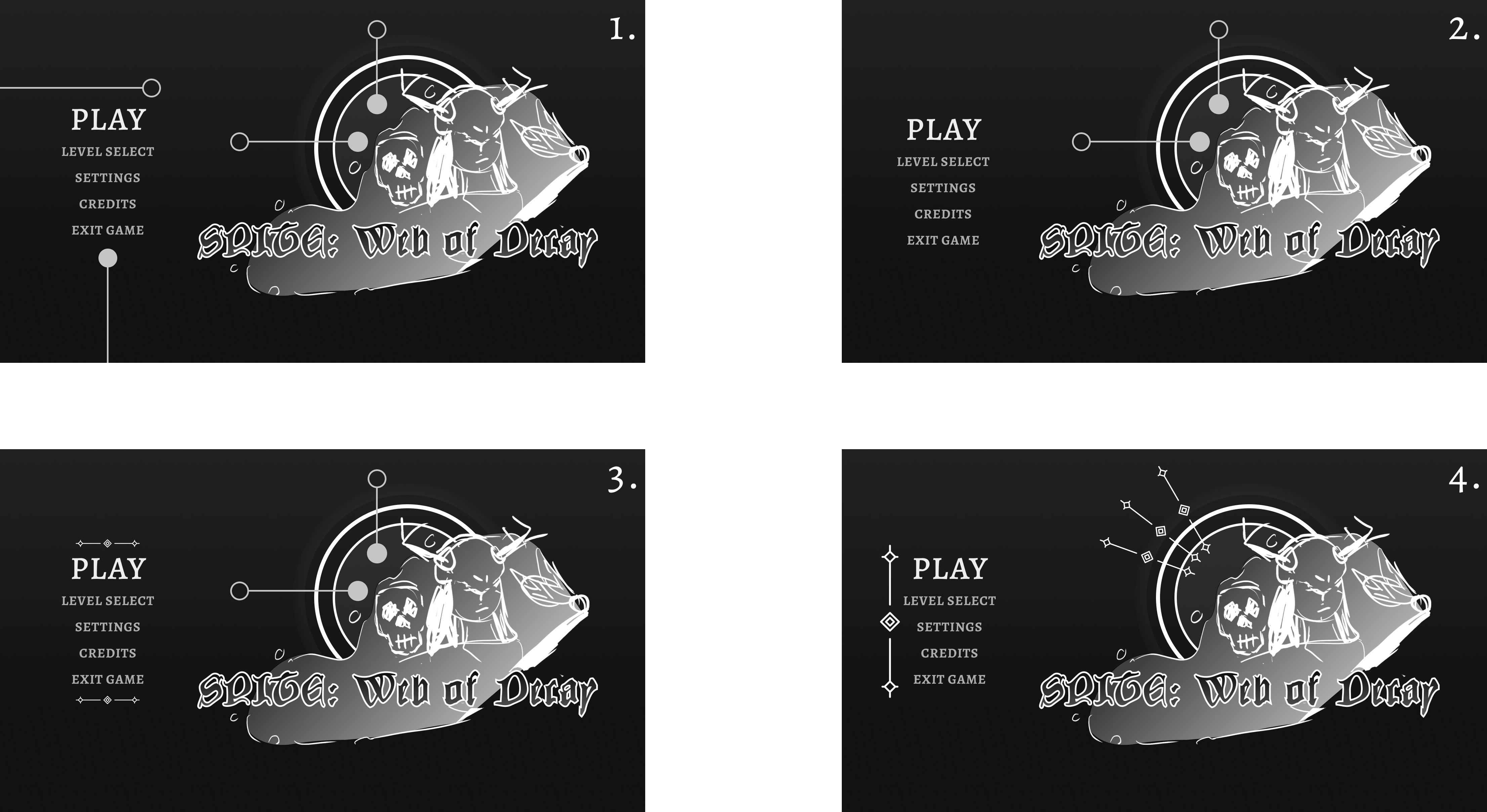
UI Mockup Menus - Iterate on first draft
Plan of Action
- Main inspiration is number 6, big focus on nice intricate logo!! Get more references and examples. Check how Final Fantasy does the rest of their UI as well.
- Based on the buttons from number 2.
- Colors from number 1 and number 2?
- Less corporate and more handmade vibes.
- Buttons right or center aligned.
UI Feedback - Iterate on first draft

- Which mockups people like most:
| Mockup | How many? |
|---|---|
| 1 | - |
| 2 | 1 |
| 3 | 2 |
| 4 | 3 |
- Continue with 4.
UI Mockup Menus - Color Palettes

Which color palette people like most:
| Mockup | How many? |
|---|---|
| 1 | - |
| 2 | 8 |
| 3 | 8 |
| 4 | 2 |
| 5 | 5 |
| 6 | 3 |
- Go with 3 but make it pop more.
UI Mockups Menus - Finished

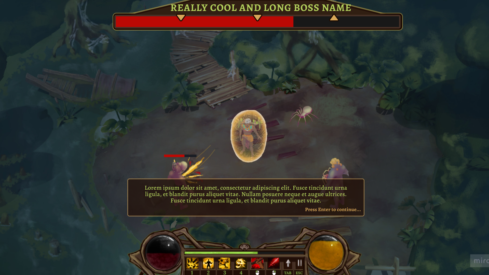
UI Mockups HUD - First Draft

Notes for polish stage
- Update skilltree to match how it looks in Miro!